Mood Board
Here is a mood board i created with some current album covers. From these i can see what looks successful and professional and see what doesnt work well. I could also use these album covers fpr ideas of my own.
Here is a mood board i created with some current album covers. From these i can see what looks successful and professional and see what doesnt work well. I could also use these album covers fpr ideas of my own.
Practice For Digipak
Before i started developing the photos i had taken into a album cover i decided to try out different tools on PhotoShop to see what works well. I looked at the different effects and filters that are available and other tools that change a photos appearance. Below is a screen shot of the different photos i edited and the tools i used:


Fonts
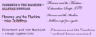
By doing these practice covers it made me think about what font styles work well with albumn covers. The font is an important part as it will be used on the supporting products bringing links between the two. When looking at the font styles i had to think what style the music and see if there were fonts to match. The bands music is seen by others as soul inspired indie, so using dafont.com i found the fonts below:


No comments:
Post a Comment