Thursday 1 April 2010

Institution Information

As an additional piece of work i produced this 'fictional diary', which shows what a annual plan might look like for an artist. I tried to highlight main areas like, touring, releases, promotions and awards. I also thought carfully abour distances between then all and dates that are appropriate.

How to advertise etc
how the bands promote their work and how they target their audiences,

Evaluation Question 4

How did you use media technologies in the construction and research, planning and evaluation stages??

Throughout the enitre media project i have used a number of media technologies. Each was used for different stages and different areas. I feel that the different programs I used helped me to produce a successful piece of work.

For the research stages of our project I used the internet a lot. Sites such as YouTube and Wikipedia allowed me to do relevant research with helped me in the production of my work. I got to see exisiting products, information about music and what makes a good product.

The only media technology I used in the planning stages was Celtx. I used this in my planning stages, as it allowed my to make a detailed storyboard. This program gave me a chance to bring in pictures, choose what camera shots i wanted and add descriptions. I found it easy to plan out how i wanted my video to flow, it also gave me the option to go back and make changes, where as without this technology i would have drawn this plan out, and changes would have been hard to make.


Once I had moved onto the construction of my project i needed to learn how the camera equipment. The camera I used was very professional and I feel this showed in the quality of my video. At first i found the camera difficult to work with but after a few tries i was able to see what worked well and how the camera should be used. This technology allowed me to watch back and re-do areas of my work. It also helped my to produce my steady camera shots.


After shooting my film all the media technology was to edited my film and produce the supporting products. Premier Pro proved very succesful as an editing program. It provided me with the relevent effects and a self explanatory set up. This helped me with my confidence and allowed me to experiment with a number of ideas. We were also using Mac computers which are known for there success in editing programs.


I used photoshop for both of my supporting products. Photoshop is a very successful program and enables you to manipulate images to become what you want them to be. Although I sometimes find the tools hard to work out, you always have a professional finish when using the program. I feel like this program gives you the independence to make a piece as individual as you want it. I think photoshop benefitted me greatly as it allowed me to gradually build my products whilst taking away and adding new ideas as I went.


For me to be able to produce my supporting products i first needed to take images that i would be able to include. The camera I used was a Digital SlR. It is one of my own and i am very familiar with it. This enabled me to experiment with different shot, distances and lighting until i came to the photo i wanted. It was also nice having different settings on the camera to see if any f this complimented the photo.

During all three of these stages i have been keeping a detailed blog, outlining my prgression throughout the course. This blog shows all areas of, research, planning and construction. I found blogger a good way to look back at my work and develop my ideas or refresh my memory. The site also allowed my to upload my video for others to view and comment. This helped me evaluate my work and look for areas of improvement.


As well as posting my video on Blogger I also posted my final piece on Facebook, the popular social networking site. On here others, rather than just media students were able to comment. 

Evaluation Question 3

What have you learned from your audience feedback??


Another way of me getting feedback was by posting my video on the social networking site FaceBook. By posting it on here I was able to get fresh feedback from random watchers, and not focused media students, who know what to look out for. This was a good way for receiving comments, however not all the responses were detailed enough, for any evaluation benefit. All my comments were very positive and gave me the confidence to see that my video would be successful against real media pieces. I would just like to highlight how one of the comments received shows an understanding of the bright lighting i have used in some of the 'other world' scenes. This gave me a positive feeling, compared to the number of people from other areas of research, that felt this light was an interference.


Evaluation Question 2

How effective is the combination of your main product and ancillary texts??


Hi I’m Broden and this is the Music video I Produced for my A-level Media. I used a song by Florence and the machine, called ‘Rabbit Heart (raise it up), taken from the album ‘Lungs’.

As Florence and the Machine are known as an Indie soul band, I wanted to reflect this through both my main product and supporting products. The band appeal to ages between 15 and 30, so I made sure all my products met this criteria.

I wanted my artist and other subjects to have a very relaxed but edgy look within the video to match with the song style and theme. I also tried to use lighting, mis-en-scene and camera movements to reflect this style as well; this was easy due to my previous research.

The story of my video took an “Alice in wonderland’ type theme. To do this I created another world, where everything was different and dream like. This was made clear by the effects I used setting them apart.

The effects I used on these ‘other world’ parts effected how I went on to design my Digi-Pak and magazine advertisement. I wanted to keep a house style, which would be recognized by an audience. I did this by making my Digi-Pak a limited edition version. This means that although albums do not usually focus around one song I was able to.

Digipak Appears

The way I made these similarities clear with all the video, advertisement and Digi-Pak was using the same effect i had used on the' other world' shots, which was changing the Brightness and Contrast, and then changing them on both Premier Pro and Photo shop. Once this theme had been set I was able to focus on making my Digi-Pak as eye catching as possible. I did this by using a number of images, brief text and attractive colours. With my previous research I was able to see what this type of band usually use and tried to keep within this boundaries, but still adding my own uniqueness. I wanted the digipak to focus on the artist. I feel that it is important for an artist to be recognised, and her face is what audiences will see. I like the collage used for my back page, I have seen this style frequently used and think it is really effective on an album. I also added a Thank You page, with a signature, as if she had signed it herself, firstly because this is attractive to an audience, also because i mentioned it on the advertisement, and it brought them all together.

Magazine Advertisement Appears

Here is My Magazine Advertisement. As you can see it follows the same theme as my Digipak. I have used a similar but different image, but with the same card over the eye. It also has the same border and card them to the entire page just on a larger scale. I also used the same font styles and colour blocking. This advertisement also includes text, so these areas mentioned are then displayed within the Digipak. I feel that this advertisement, shows the importance of the Alice in wonderland theme. Its displays directly what song the album focus on. The links between this and my Video and supporting products clearly match the music style and genre.

Overall I feel that my three products all have clear similarities and reflect what the audience and record companies are looking for as well as promoting the band successfully. I also feel that all my products were well produced based on my research and own ideas.

Evaluation Question 1

In what ways does your media product use, develop or challenge forms and conventions of real media products??


Monday 22 March 2010

My Timescales

Date and Time Plan


10th September  - Given Brief

15th September -  Began planning and researching

28th October -  First video shoot – filming Emily in country park. 10am - 3pm

10th November -  Begin editing

8th December -  Finished editing my footage – gaps need to be filled

6th February -  Second video shoot – with all three characters. In country park. 12pm - 2pm

9th February -  Capture new footage and begin editing

2nd March -  Finish video promo

9th March -  Begin on supporting products

Contribution to other groups

Although I produced my media piece as an individual candidate throughout the entire media course I have taken part and given ideas to other students within my class. It was nice to be involved in other creations and having an influence over others work. I also thought it was a good way to develop other skills.

I helped by playing various roles in Meeghan Stevensons work. I was the bride character, the teen love character and the character for lonely. I also helped with camera distances and lighting in some parts.

I also helped Joshua Cox in the cermatory scene. I offered ideas and helped with directing.

As well as my class i also helped a group from Wilmington Grammer School. I played a part within there party scene.

Sunday 21 March 2010

Final Magazine Advertisement

Final Piece

How I got there...


Firstly I opened photoshop and picked a document size of A4. Then added a black border using the shape tool. Then I edited it to make the line thick. Once this was done I opened my image in a separate page. With this image I put on a large square shape in an opaque beige colour at the bottom. With this colour I then used the erase tool and add a torn edge effect to my photo.  I then dragged this over into my bordered page. 


Once I had dragged it over I began adding design to the page. Firstly I dragged in the heart shaped and transformed then to the correct size and position. I then added the F letter (for Florence) in the top and bottom corners as this is what is found on cards. I then began on editing the text, adding drop shadows, changing the sizes, and positioning. Once this was complete, I made a block red shape, and added a torn paper look using the ease tool. I put this under the Band title to make it stand out from the page. This gives a statement look to the page.


I then began adding black box shapes. I kept these without effects as i wanted them bold but sharp on the page. With these boxes i changed the positioning and rotated them. Then put on the important text in white (contrasting colour) The image below shows a top hat slightly opaque in the corner. This was an experiment I tried but decided it was to much on the page and took focus away from the main image. 


After this I came to my final piece which is shown at the top of the page. For this I added another black strip saying "Bonus Tracks" to fill in the large space. Then a faded white heart in the bottom corner with a slight drop shadow to make it stand out from the background. I found this was a simple effect but added depth to the advertisement. 

Friday 19 March 2010

Magazine Advertisement Influence

Before i began developing my own Magazine Advertisement I looked at a variety of magazines with Existing products. From these i took ideas, and developed my own. I found it a good way to see the relevant information and how a page can look successful. Below are scanned copies of the few I found most helpful.


Final DigiPak

Final Piece
Here is my final digipak. Here you can see what it would look like if i folded it out. I have included the CD itself, followed by the three outside pages, then the three inside pages. 

My page ideas were (left to right) :
Outside fold - Thank you from artist. Limited addition version (would not be found on normal album)
Front cover  - Capturing image.
Back page - Track listing
Inside page - Picture collage of the artist.
CD page - Showing where the CD will be positioned with a simple border
Inside fold - The lyrics of one song. This is the feature song on the limited Edition Version. This would not be found in normal album. 


Planning
Here is my planning for the final digipak. I found drawing it out gave me something to work from and develop. I didn't keep to all the ideas, it was just a basic outline of what I wanted to include.


How I Edited...
This is what the CD itself will look like. I took a Cd shape found online and began editing it using photoshop. The two diagonal black lines were made using auto-shapes. They fit in the with the background on the album itself to give the look of a playing card. I then added a large heart shaped taken from the back page. I changed the opacity so that the shape looked blocked then took out a circle shape from the middle using the erase tool. From here i just added text, using the style as i have used on all other products and pages. 


This is my fold out page. It is what you will see when you open the album. I wanted this to be quite plan as the opposite page (collage) is very busy. I took an image taken by myself and changed the opacity. I then dragged across the torn strip from my poster to keep an ongoing theme. On this I added formal text as it is details of production. I wanted this page to be a "Thank You" from the artist, so used a more handwritten font as if she had written it herself followed by her Autograph hand written using the paint brush tool. This gave it a personal and individual look.


This is my back page. I wanted the focus of this to be on the tracks. I used the same style text and had it in white to stand out against the background. I then took the black strips from the poster to put under various titles, to give it an edgy look. I then added a large heart shape, (edited to size in other window) with this i changed the opacity so that it didn't take attention away. This is a shape used to identify with Alice in Wonderland. From here i used the barcode font and moved it to an appropriate position. The page still looked rather empty, so i took the image from the front cover opened it in a separate window and lowered the opacity, and size. I then dragged this layer over multiple times to get this background.


This is my Front Cover. I followed the same idea as my magazine advertisement, just in a different size and different central image. I also took over the same red torn paper, black block, and main text. This was very easy to develop after making my poster. I Wanted it to be quite plain but effective and i think this was successful.


Here is my collage page which will be on the left hand side as you open the album. I took varies images of emily that i had take over the previous months on different occasions. I knew that i wanted one of my pages t be a collage so this images were a build up. I opened each image in a different window adding effects to each and changing the sizes. I then dragged them into the actual window and positioned them accordingly. I found this gave a personal touch to the album and gave he artist a identity. I then added small red harts to keep the theme.


This is the page where my CD will be placed. I Wanted this to be very basic but keep the theme. I took the playing card idea but created the shape myself using the shape tools. I then rotated it all so that it was coming off of the edges. I thought the black white and red together looked effective. With the CD also in the picture i feel it will look very professional.


This is the inside page of the fold out. I wanted this to be quite bold so used the dark background. I then kept to the colour scheme using rd text and white strips. The white strips were a copy from the poster, changed with the colour fill tool. I then added red hearts to match the opposite page (collage). These lyris were the only ones included in the digipak and they are the from the song i used and the song which has brought on this Limited Edition Version.


Tuesday 16 March 2010

First attempt at DigiPak

This was my first attempt at a final album cover. In this pictures I used the subject I have in my video. The pictures were taken at the same setting as the video was recorded. I liked the sunset theme and used appropriate font and text colour to follow this lighting. I think this album cover looks professional, but isn't enough to draw attention to the public. An album needs to be individual and have something special. As these thoughts have occurred I have decided to give another attempt to see if I can bring something more original to the table.


Monday 15 March 2010

Practice for Digipak

Mood Board
Here is a mood board i created with some current album covers. From these i can see what looks successful and professional and see what doesnt work well. I could also use these album covers fpr ideas of my own.


Practice For Digipak 

Before i started developing the photos i had taken into a album cover i decided to try out different tools on PhotoShop to see what works well. I looked at the different effects and filters that are available and other tools that change a photos appearance. Below is a screen shot of the different photos i edited and the tools i used:


By experimenting with these tools I then moved on to practice album covers, using the bands name. To do this I used images from the internet, my own images and different font styles. I experimented with different lighting and different actions when taking my photos, which led to me having photos that were far to dark and others over exposed. Although by making some of these mistakes I have expanded my knowledge on editing. Here are my four initial ideas:


Fonts
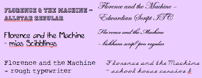
By doing these practice covers it made me think about what font styles work well with albumn covers. The font is an important part as it will be used on the supporting products bringing links between the two. When looking at the font styles i had to think what style the music and see if there were fonts to match. The bands music is seen by others as soul inspired indie, so using dafont.com i found the fonts below:


Presentation Evening

Since we have now finished producing our films, our school decided to put on a presentation evening for parents and other visitors to come and watch all the A-level Students work.

The presentation evening was held on Wednesday 10th March 2010 and was very successful. We had around 40 viewers and was able to get some appropriate feedback. Each student produced there own questionnaire with questions that would benefit there individual work. This idea so was that we could then take this criticism and praise and use it in our evaluation and see areas we would change if we were to re-make our videos.

I personally found the evening very informative and enjoyed showing the work i had created to others.

Saturday 13 March 2010

Final Film

Below is my final edited Music Promo
- Rabbit Heart (Raise it Up) by Florence and the machine.
I hope you enjoy it...

Wednesday 10 March 2010

Editing my Video

After i had all the footage i needed for my video it was time to capture it on to the computer and then start editing.To edit our footage we used the program 'Premier Pro' as this is what the school provides. I found the program difficult to start with but once i knew where the tools were, editing the video went smoothly.

Below are screen shots an explanations taking you through key parts of my video, and highlighting the areas with most effects used.


This sequence can be seen at the beginning of my video. The editing technique I used here was just a simple cross dissolve. I used this same technique a number of times throughout my video as well as dissolve to black/white. This is a way to take one clip to another smoothly rather than short cuts from one to another.


The technique I used here is a basic 3D. With this tool you have no decide yourself where you want it to move by choosing when it twirls, the distance it moves to and how far it tilts. It was hard to use at first but once you get the hang of it you simply plot on a editing graph where you want each bit to change and then preview until its what you want. 


Here i used a simple strobe lighting technique. When i first edited this clip the strobe covered the photo but i changed the opacity and now with each flash you can still see the underlining image. I feel this strobe was a light cover and matched the build up of music. 


When editing this clip i used a filter to change the whole clip to black and white, even before i began cropping. Once i had cropped the clip i cut it just before she throws her leaves. Where i cut the clip i then put a slower speed on the second half as the leaves fall. This added a dramatic feel to the clip.


This is taken from one of the 'other world' scenes. On all of those scenes I changed the brightness and contrast to show the difference. I think that this effect gave the clips a dream like look as well as mysterious. 


This was the mirror scene. This was the hardest part of editing I did in my video. I had to separately film daisy and emily from the same angel but think about where I was framing them with the mirror. I started with the complete clip of emily looking at herself in the mirror. Then halfway through the clip i cropped the mirror of emily to one side and added the clip of Daisy's reflection in that gap. This gave the view that emily was looking at herself then sees a different reflection (that of the rabbit). On both the clips i put changed the brightness and contrast.